Stepping into a home bathed in soothing, timeless neutrals is like taking a deep, calming breath. Gone are the days when neutral meant beige and boring. Today, a spectrum of sophisticated shades awaits, each whispering understated elegance and offering a canvas for your personal style to shine.
Whether you’re drawn to the cool embrace of greys or the gentle warmth of creams, choosing the right neutral can be daunting. Luckily, tools like the Dulux Paints Shade Card and the Nippon Paints Shade Card make exploring your options a breeze. With a vast array of shades at your fingertips, you can easily find the perfect hue to complement your space.
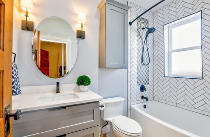
The Power of Grey: From Dove to Charcoal
Grey is the undisputed king of contemporary neutrals, radiating both sophistication and versatility. A light dove grey, like Dulux’s “Goose Down,” can make small rooms feel spacious and airy. Explore this shade on a colour visualiser to see how beautifully it pairs with natural textures like wood and linen.
For a bolder statement, delve into the deeper end of the spectrum with a rich charcoal hue. A rich charcoal grey adds depth and drama, particularly in spaces with ample natural light. Use it on an accent wall to create a striking focal point, or embrace its enveloping warmth by painting the entire room.
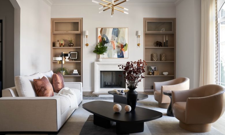
Beyond Beige: The Allure of Warm Neutrals
If cooler tones leave you cold, then embrace the inviting embrace of warm neutrals. Creamy whites like “Antique White” from the Dulux Paints Shade Card evoke a sense of classic elegance, while subtle beiges like “Urban Taupe” from the Nippon Paints Shade Card offer a touch of warmth without feeling dated. These versatile shades are perfect for creating a cosy and inviting atmosphere in living rooms and bedrooms alike.
Don’t be afraid to experiment with texture and finish to enhance the warmth of your chosen shade. A matte finish on your walls can create a soft, inviting feel, while a satin or eggshell finish will add a touch of subtle sheen.
Creating Depth and Interest: It’s All in the Details
The beauty of neutrals lies in their ability to act as a backdrop for your personal style to shine. Add depth and interest to your space by layering different textures, patterns, and pops of colour.
- Play with Textures: Introduce tactile elements like chunky knit throws, woven rugs, and velvet cushions to create a sense of cosy luxury.
- Embrace Patterns: Don’t shy away from incorporating subtle patterns in your furnishings and accessories. Geometric prints, floral motifs, and abstract designs can all work beautifully with neutral backdrops.
- Add Pops of Colour: While neutrals take centre stage, a few carefully chosen accent colours can inject personality and vibrancy. Deep blues and greens create a sense of calm and serenity, while pops of burnt orange or mustard yellow add a touch of warmth and energy. Use the colour visualiser to experiment with different combinations before committing to a final look.
Remember, the key to mastering neutral interiors is to create a balanced and harmonious space. By choosing the right shades, layering textures, and adding personal touches, you can create a timeless home that reflects your unique style.
AapkaPainter: Your Partner in Creating a Timeless Home
Navigating the world of paint colours and home renovation can be overwhelming. That’s where AapkaPainter comes in. We’re your one-stop destination for all your home improvement needs, offering expert advice, a wide range of Dulux Paints Shade Cards and Nippon Paints Shade Cards, and a team of skilled professionals to bring your vision to life.
Let us help you create a home that is both stylish and timeless, a sanctuary you’ll love coming home to for years to come.